Listen to this article:
I want you to know that I resisted the urge to start this with the cliché “a picture is worth a thousand words…” But I’d like you to consider that phrases become cliché because they’re true. Few things can ruin great marketing faster than using lousy photos, and few things are as easy to fix.
So how can we ensure that the photos we select for our marketing don’t hinder our message?
1. Pay attention to the fore- and background.
When looking at a photo, it’s easy to focus on the subject and not see everything else around it. Take a look at this photo:

I understand the logic of selecting a photo like this. We have highway access, and this is a picture of trucks on said highway. But what else is it a picture of? Unappealing weather. If we want the community to look desirable to residents and prospective businesses, showing our worst weather is not going to help. Other things to watch for include standing water, downed or broken tree branches, and those digital temperature signs that a lot of local banks have.
Bad weather may seem like an obvious blight to avoid in your photography, but there are a lot of fore- and background items that can be off-putting for your audiences. Keep an eye out for:
- Trash, trash cans, and dumpsters
- Broken or rusty fences
- Police cars
- Political yard signs and billboards


2. Show a diversity of diversity.
We all (should) know by now that showing diversity means more than including a picture of a woman or a Black person every once in a while. While racial and gender diversity are often the primary topics of conversation, our population (and our audiences) are widely varied. We must consider, if you will, a diversity of diversity.
Quality of life pages are home to pictures of residents out and about in our communities. These photos are often of families and those families are almost always young, straight, white couples with their two kids.

But this clearly doesn’t represent all families. On average, people are waiting to have children later in life1 or (like yours truly) opting to not have children at all2. Also, nearly a third of Gen Z adults in the United States identify as LGBTQ+3. All of this combines to shift our outdated ideas about what “family” looks like, and our quality-of-life photography needs to be updated to reflect our talent and residents more accurately.


Let’s also be mindful of disability representation. According to the CDC, up to 27% of adults in the United States have some type of disability4, and 15% of students enrolled in public schools in the United States have a diagnosed disability5. These are our friends, family members, and colleagues. They should be able to see themselves represented in our marketing.


3. Show people, not buildings.
Let’s imagine that our website has incredible copywriting that really hypes up the high school CTE programs that we’ve worked so hard to foster. We use phrases like “innovative,” “cutting edge,” and “state of the art.” Then, to show it all off, we choose this photo:
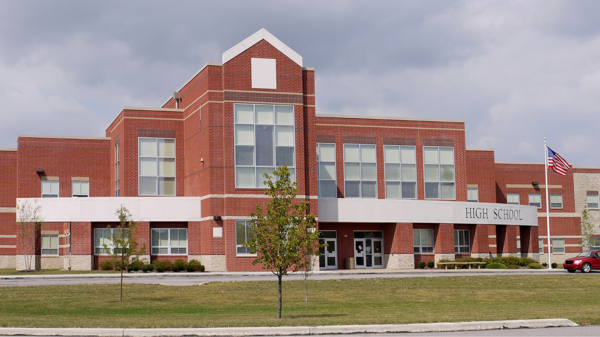
Not a student in sight. Not a single piece of technology. How is this supporting our narrative of innovation?
Alternatively, let’s select photos that show off the learning environment and the students in our workforce pipeline.


In a similar vein, so many economic development websites talk extensively about workforce and then don’t use photos of actual workers. You know, the people who make up this workforce we’re always talking about? Instead, we use a lot of these:

A building exterior tells the audience nothing about what that business does. And a sign is only useful if the business name is widely known. Our workforce stories will be better supported by photos of workers utilizing the skills desired by our target industry sectors.


When you’re done reading (or listening to) this article, hop over to your website to have a look around. What narrative are you trying to get across? And are your photography choices helping or hurting that narrative? I always tell my presentation audiences, “If you see yourself in the bad examples, reflect on what that means.”
2 “Study: One in five adults don’t want children — and they’re deciding early in life,” MSU Today
3 “Gen Z adults identify as LGBTQ at much higher rates than older Americans, report shows,” CNN
4 “Disability Impacts All of Us,” Centers for Disease Control and Prevention
5 “What federal education data shows about students with disabilities in the U.S.,” Pew Research Center
